The Secrets Behind Website Color Schemes
Website color schemes can really make an impact on the user’s experience. You really need to take the time to think about your business and how you want to be portrayed by the user when you are choosing your color schemes. Every color will send a different message. You really don’t want a user to come to your site and be turned off completely by the design color scheme and leave right away. You want it to grab their attention and pull them in to make them stay on the site longer.
A bounce rate is the percentage of visitors that come to your site and leave while only viewing one page. The idea is to keep your bounce rate as low as you can because you want your visitors to browse through your website.
So where do you start when you want to choose colors. Well I would say don’t overthink it. Website color schemes are important, but I wouldn’t say rebrand everything because you think your colors are wrong. If you already have a logo with colors that you like, then base your website colors around that. In general, it’s good to have a color scheme with a 3 color combination. This is what is called a triadic color scheme. But, you don’t want to lean to primary colors in all three colors. It’s a good idea to choose one primary color and then secondary colors. That’s the route that most designers take.
There’s a lot of people that think white and black are the enemy when that’s not true at all. White and black are your friends! Don’t be afraid of white, empty space on your website because you don’t want areas of your website crowded anyway. Black is good in backgrounds of some areas and for color design, just use it sparingly and not around fonts.
Emotions Associated With Different Colors
Here’s where we jump into the technical aspect of colors. Each color triggers an emotional aspect to a user. Scientists have figured out that colors conjure up emotions. Some colors may make us happy, alert or relaxed, while others tap into darker feelings and can make us anxious, sad and depressed. For example…
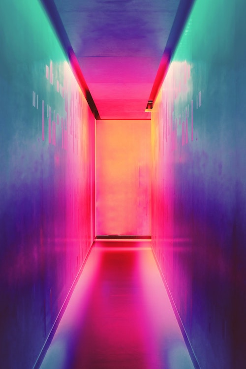
Red
Symbolized importance, passion and aggression. Think of stop signs, to-do lists, love, hearts, and the angry face emoji. Yes, red can really pop on your website and bring attention to it, but I would advise to use it sparingly because yes it’s really out there, but could cause users to think darker thoughts and possibly overwhelm them.
Yellow
Can play the part of happiness, sunshine and fun. But, it also creates the idea of anxiety in the brain so use with caution.
Blue
Blue has the power to have a real calming effect, along with safety and trust (look at my site). It is one of the most popular colors chosen by web designers for obvious reasons. It’s like you’re inviting the users into your home.
Green
When you think of green what do you think? A lot of you would relate green to the environment and that would be correct. It’s associated with health, environmentally friendly initiatives and organic products.
Orange
This color can be related to high energy and up beat sites, but be weary because it’s also related to “low prices.” So if you are selling high end cars, you don’t really want to be associated with orange.
Purple
And finally, purple. Purple is a lot more powerful than you think. It’s associated with high end, elegance, mystery, and for some reason, creativity. This is the color you want to choose if you are selling those high end cars I was talking about. It’s also very sensual.

