Choosing The Best Font Style For Your Website
Font Style
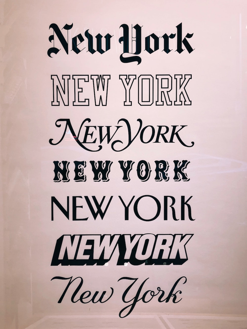
Fonts can place such an important role in the designing aspect of a website. A great font style that goes along with the entire personality of your business can take a good website and turn it into a great one. There’s a way to choose the proper font that will relate to your brand and business. For example, if you have a finance or tech website, you’re going to want to choose a font that is modern, and somewhat elegant. If you have a youtube channel or brand, it needs to relate to the personality of your business and blog.
You don’t want to go crazy when it comes to choosing fonts. Be very consistent. Don’t choose multiple fonts. But if you do, no more than three. And make sure the fonts work well together. Generally, everyone goes for Google Fonts when choosing them. These are what they call web safe fonts. That means the fonts won’t have issues showing up in different browsers or on different devices. There could be a font style that you purchase exclusively for your site, but a different browser might not show it, or the design will look all messed up. Even if it is a “web safe” font, doesn’t mean it will look good on multiple different screens so make sure it looks crisp.

Font Size
Along with choosing the right font, you also want to be aware of font size. There are many different eyes in the world that all see differently. MAKE SURE YOUR FONT SIZE ISN’T TOO SMALL. I cannot stress it enough. The amount of sites that I have seen with minuscule font is outlandish. And by minuscule, I mean 12pt and less. You are not writing your 20 page research paper for your finals, you are advertising. You want all of your audience to be able to know what your website is saying. Even on blog posts I always recommend 14pt and greater. On the opposite end, you don’t want the font size too big. Keep your headings as headings, either H1’s or H2’s. And keep paragraph text as paragraph and adjust font size from there. This will also help search engine easily crawl through your site.
Emotional Design
Similar to my color schemes post, fonts can show signs of emotion. For example the Anton font shows strength and boldness with defining how “heavy” it is. You might want to use this font if you are a gym owner. While EB Garamond is more sheik and elegant. Maybe use this font for a jewelry website. It shows sophistication and makes you feel like you’re at a $500 a head charity dinner.
This all just relates to design techniques. If you are any sort of designer working with typography, you should already know the correlation between brand personality and fonts. Everything should flow down the page to intrigue the user to keep scrolling and reading, moving from page to page.
If you are interested in my advice relating to the font on your website, be sure to contact me!

